Chompz
Chompz
Chompz
Chompz
Chompz
Year 2026
Services Packaging
Scope Six Packaging Designs
Year 2026
Services Packaging
Scope Six Packaging Designs
Year 2026
Services Packaging
Scope Six Packaging Designs
Year 2026
Services Packaging
Scope Six Packaging Designs
Year 2026
Services Packaging
Scope Six Packaging Designs
Overview
Overview
Overview
Overview
Overview
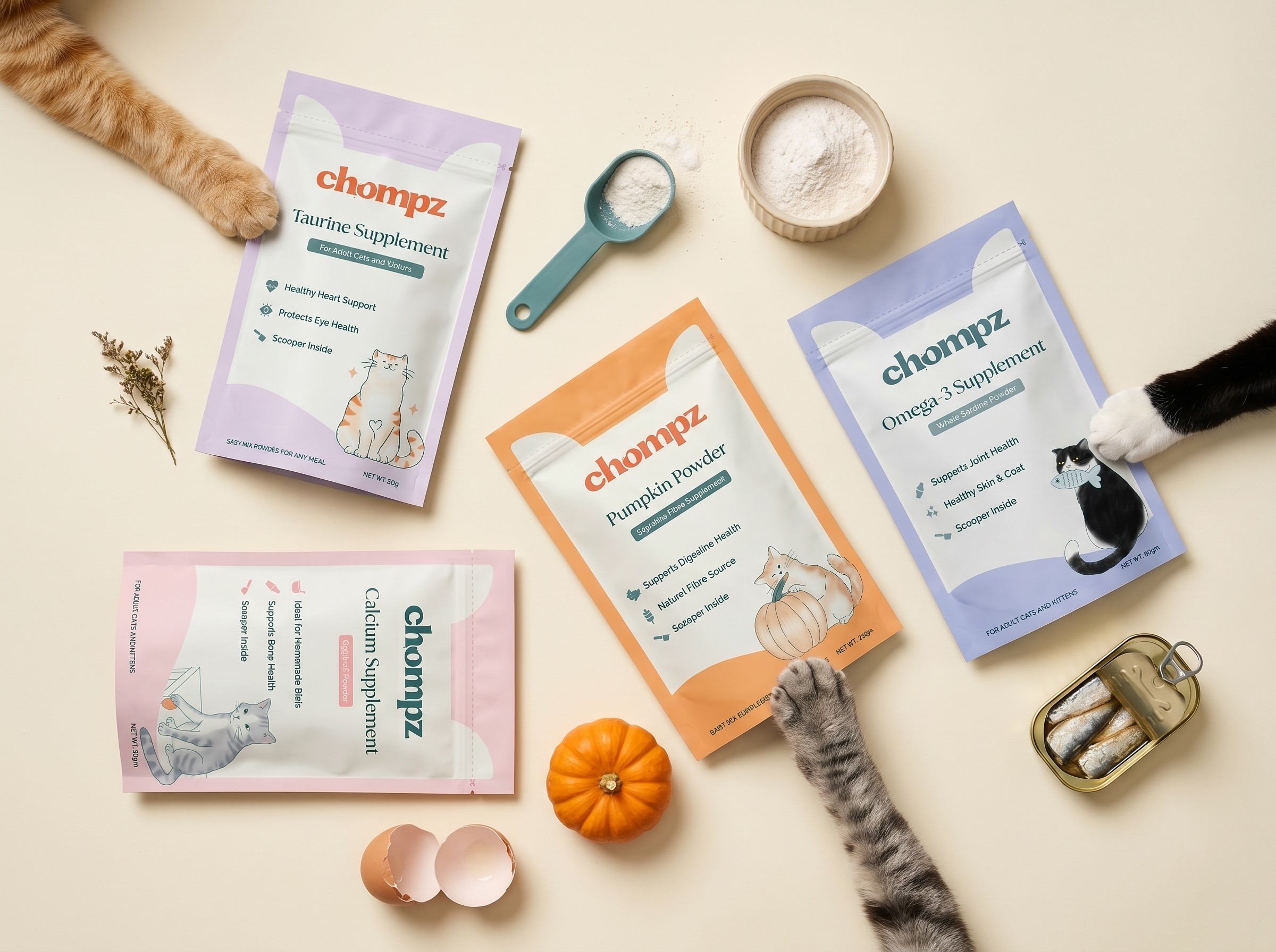
Chompz is a cat food brand focused on providing wholesome, thoughtfully made nutrition for pets. Built around care, quality ingredients, and trust, the brand speaks to pet parents who see their cats as family.
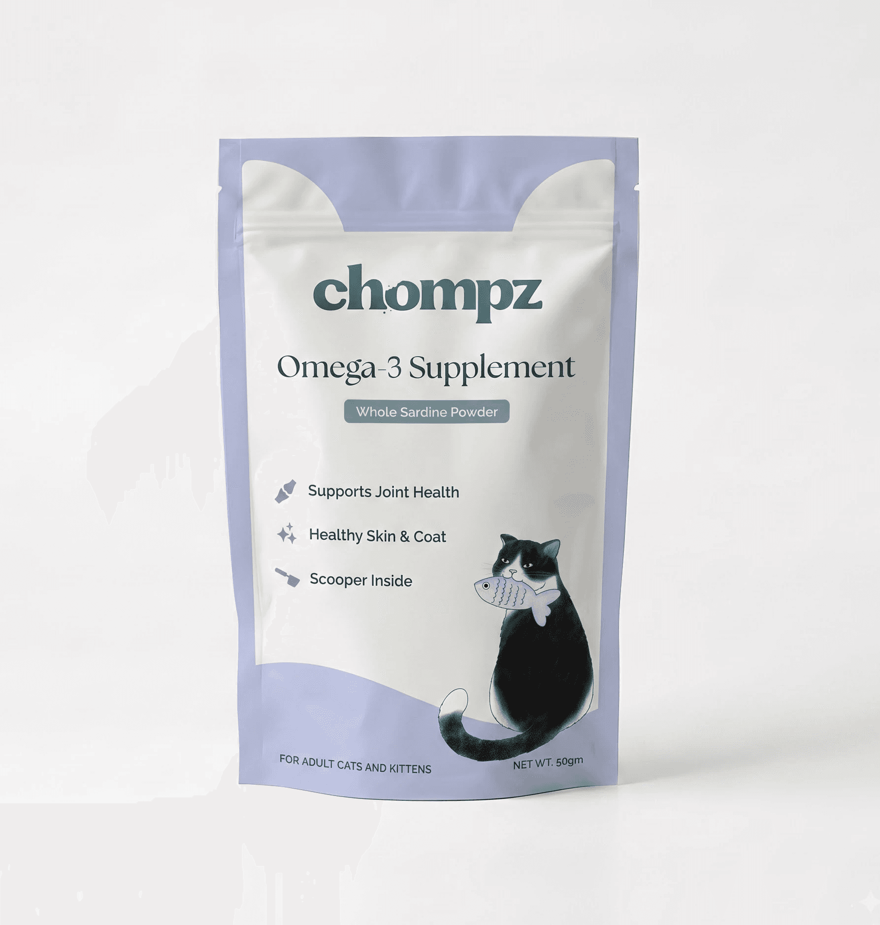
This project involved creating a series of packaging designs for two main skus, one is a standup pouch and another is jar. The idea was to create design systems that not only represent the brand well but also create its own meaningful space in the market.
Chompz is a cat food brand focused on providing wholesome, thoughtfully made nutrition for pets. Built around care, quality ingredients, and trust, the brand speaks to pet parents who see their cats as family.
This project involved creating a series of packaging designs for two main skus, one is a standup pouch and another is jar. The idea was to create design systems that not only represent the brand well but also create its own meaningful space in the market.
Chompz is a cat food brand focused on providing wholesome, thoughtfully made nutrition for pets. Built around care, quality ingredients, and trust, the brand speaks to pet parents who see their cats as family.
This project involved creating a series of packaging designs for two main skus, one is a standup pouch and another is jar. The idea was to create design systems that not only represent the brand well but also create its own meaningful space in the market.
Chompz is a cat food brand focused on providing wholesome, thoughtfully made nutrition for pets. Built around care, quality ingredients, and trust, the brand speaks to pet parents who see their cats as family.
This project involved creating a series of packaging designs for two main skus, one is a standup pouch and another is jar. The idea was to create design systems that not only represent the brand well but also create its own meaningful space in the market.
Chompz is a cat food brand focused on providing wholesome, thoughtfully made nutrition for pets. Built around care, quality ingredients, and trust, the brand speaks to pet parents who see their cats as family.
This project involved creating a series of packaging designs for two main skus, one is a standup pouch and another is jar. The idea was to create design systems that not only represent the brand well but also create its own meaningful space in the market.
Four Challenges We Had
Four Challenges We Had
Four Challenges We Had
Four Challenges We Had
Four Challenges We Had
Cluttered & loud market
Most pet food packaging in the market either drowns in information or shouts for attention with bold colours and busy illustrations. Neither felt right for Chompz. We wanted to find the quiet gap between the two.
A wellness product that still needed to feel fun
The product range is single ingredient, nutrition first, almost medical in its intent. We wanted the packaging to carry that same trust and wellness, without losing warmth or approachability.
Designing within real constraints
With no scope for sample printing and multiple SKUs going to print together, we had limited room to work with. Every piece of information had to earn its place on the pack.
The old packaging wasn't standing out
It was following the same pattern we wanted to move away from. Loud, bold, built on stock images, and blending right into the crowded shelf it was meant to stand out on.
Cluttered & loud market
Most pet food packaging in the market either drowns in information or shouts for attention with bold colours and busy illustrations. Neither felt right for Chompz. We wanted to find the quiet gap between the two.
A wellness product that still needed to feel fun
The product range is single ingredient, nutrition first, almost medical in its intent. We wanted the packaging to carry that same trust and wellness, without losing warmth or approachability.
Designing within real constraints
With no scope for sample printing and multiple SKUs going to print together, we had limited room to work with. Every piece of information had to earn its place on the pack.
The old packaging wasn't standing out
It was following the same pattern we wanted to move away from. Loud, bold, built on stock images, and blending right into the crowded shelf it was meant to stand out on.
Cluttered & loud market
Most pet food packaging in the market either drowns in information or shouts for attention with bold colours and busy illustrations. Neither felt right for Chompz. We wanted to find the quiet gap between the two.
A wellness product that still needed to feel fun
The product range is single ingredient, nutrition first, almost medical in its intent. We wanted the packaging to carry that same trust and wellness, without losing warmth or approachability.
Designing within real constraints
With no scope for sample printing and multiple SKUs going to print together, we had limited room to work with. Every piece of information had to earn its place on the pack.
The old packaging wasn't standing out
It was following the same pattern we wanted to move away from. Loud, bold, built on stock images, and blending right into the crowded shelf it was meant to stand out on.
Cluttered & loud market
Most pet food packaging in the market either drowns in information or shouts for attention with bold colours and busy illustrations. Neither felt right for Chompz. We wanted to find the quiet gap between the two.
A wellness product that still needed to feel fun
The product range is single ingredient, nutrition first, almost medical in its intent. We wanted the packaging to carry that same trust and wellness, without losing warmth or approachability.
Designing within real constraints
With no scope for sample printing and multiple SKUs going to print together, we had limited room to work with. Every piece of information had to earn its place on the pack.
The old packaging wasn't standing out
It was following the same pattern we wanted to move away from. Loud, bold, built on stock images, and blending right into the crowded shelf it was meant to stand out on.
Cluttered & loud market
Most pet food packaging in the market either drowns in information or shouts for attention with bold colours and busy illustrations. Neither felt right for Chompz. We wanted to find the quiet gap between the two.
A wellness product that still needed to feel fun
The product range is single ingredient, nutrition first, almost medical in its intent. We wanted the packaging to carry that same trust and wellness, without losing warmth or approachability.
Designing within real constraints
With no scope for sample printing and multiple SKUs going to print together, we had limited room to work with. Every piece of information had to earn its place on the pack.
The old packaging wasn't standing out
It was following the same pattern we wanted to move away from. Loud, bold, built on stock images, and blending right into the crowded shelf it was meant to stand out on.

Moodboard
Moodboard
Moodboard
Moodboard
Moodboard



Standing out through contrast
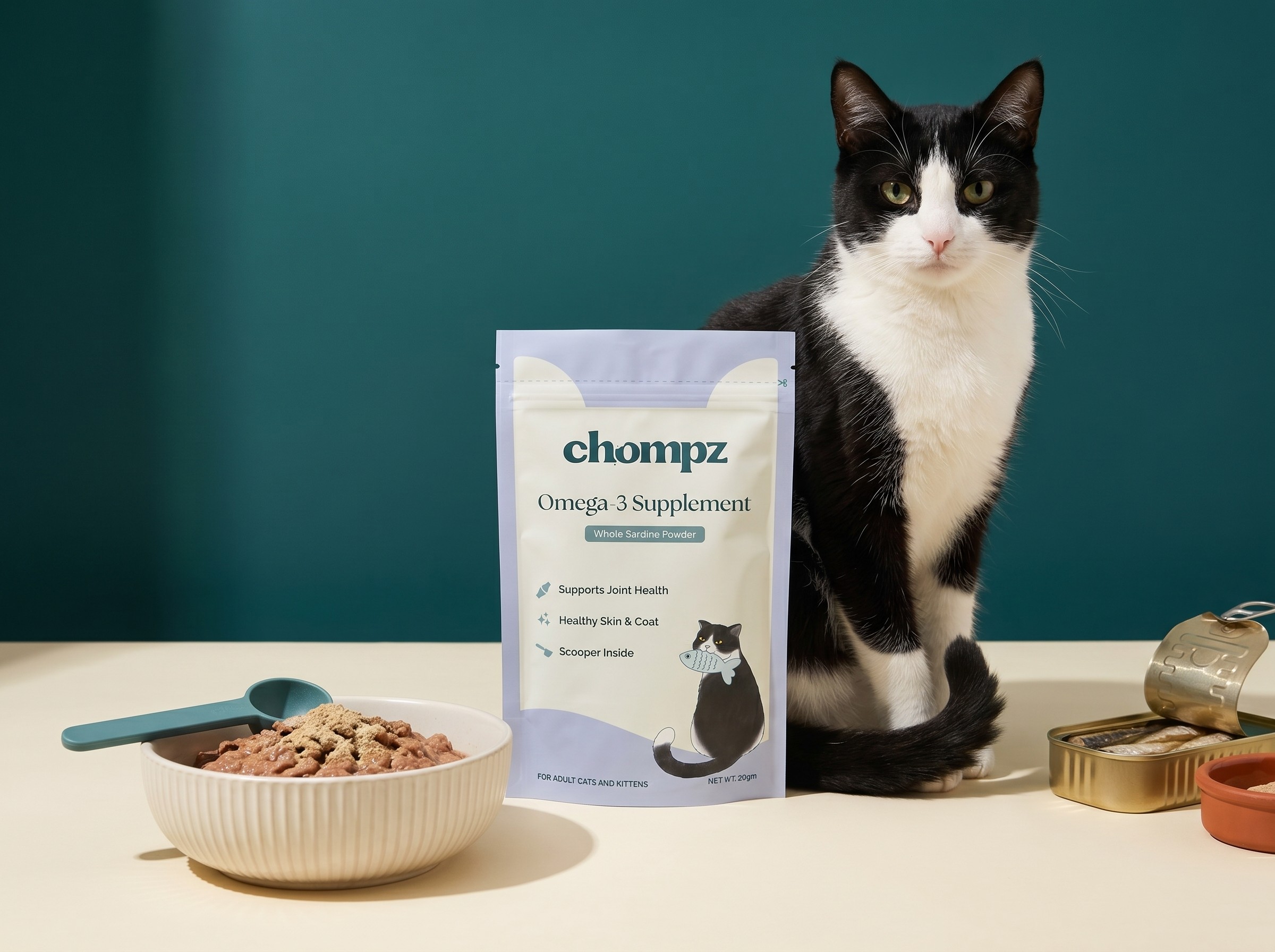
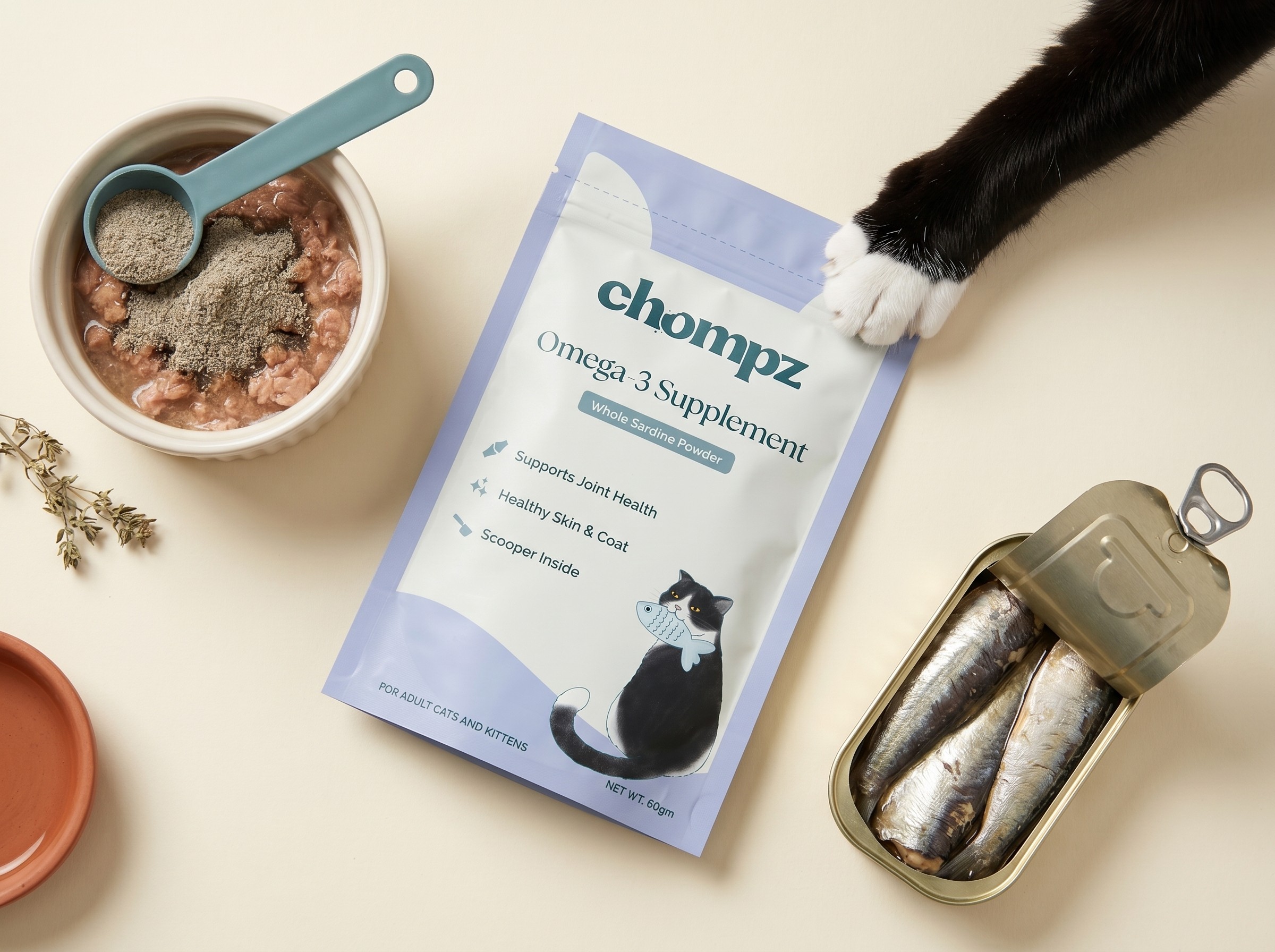
Where the category is loud, we chose calm. Pastels, white space, and restraint became our contrast on a crowded shelf.
Earning trust at first glance
The front only shows what matters: what it is, who it's for, how it helps. Minimal by design, so trust comes through instantly.
Keeping it playful, not just clinical
Small touches, like the cat ear and playful illustration ,made the product feel approachable.
Standing out through contrast
Where the category is loud, we chose calm. Pastels, white space, and restraint became our contrast on a crowded shelf.
Earning trust at first glance
The front only shows what matters: what it is, who a for, how it helps. Minimal by design, so trust comes through instantly.
Keeping it playful, not just clinical
Small touches, like the cat ear and playful illustration ,made the product feel approachable.
This design was developed as a fully illustration driven festive box, with the front featuring a custom artwork of a family celebrating Diwali. The intent was to capture warmth, togetherness, and the true essence of the festival through detailed visual storytelling.
The outer box, internal dry fruit containers, and inside detailing were developed as a cohesive system to create an immersive and celebratory unboxing experience that reflects the essence of Diwali.
Standing out through contrast
Where the category is loud, we chose calm. Pastels, white space, and restraint became our contrast on a crowded shelf.
Earning trust at first glance
The front only shows what matters: what it is, who a for, how it helps. Minimal by design, so trust comes through instantly.
Keeping it playful, not just clinical
Small touches, like the cat ear and playful illustration ,made the product feel approachable.
Standing out through contrast
Where the category is loud, we chose calm. Pastels, white space, and restraint became our contrast on a crowded shelf.
Earning trust at first glance
The front only shows what matters: what it is, who a for, how it helps. Minimal by design, so trust comes through instantly.
Keeping it playful, not just clinical
Small touches, like the cat ear and playful illustration ,made the product feel approachable.




Solving print and shelf together
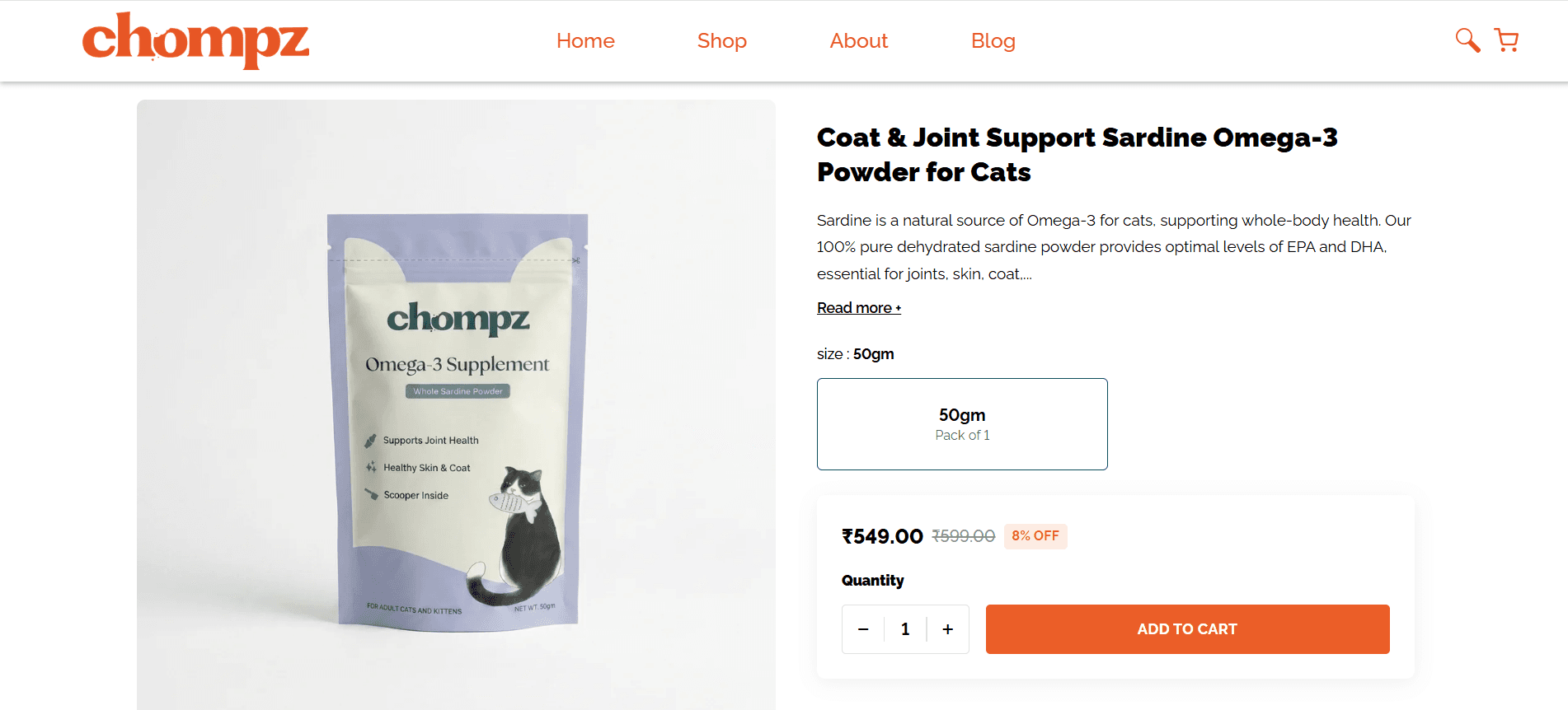
A lighter front design meant more flexibility across SKUs, no sample runs needed. Illustration replaced stock imagery, giving Chompz its own identity instead of blending in.
A back of pack that does the heavy lifting
All required information, presented through simple infographics and tables, easy to scan, never cluttered.
Extending the system to treats
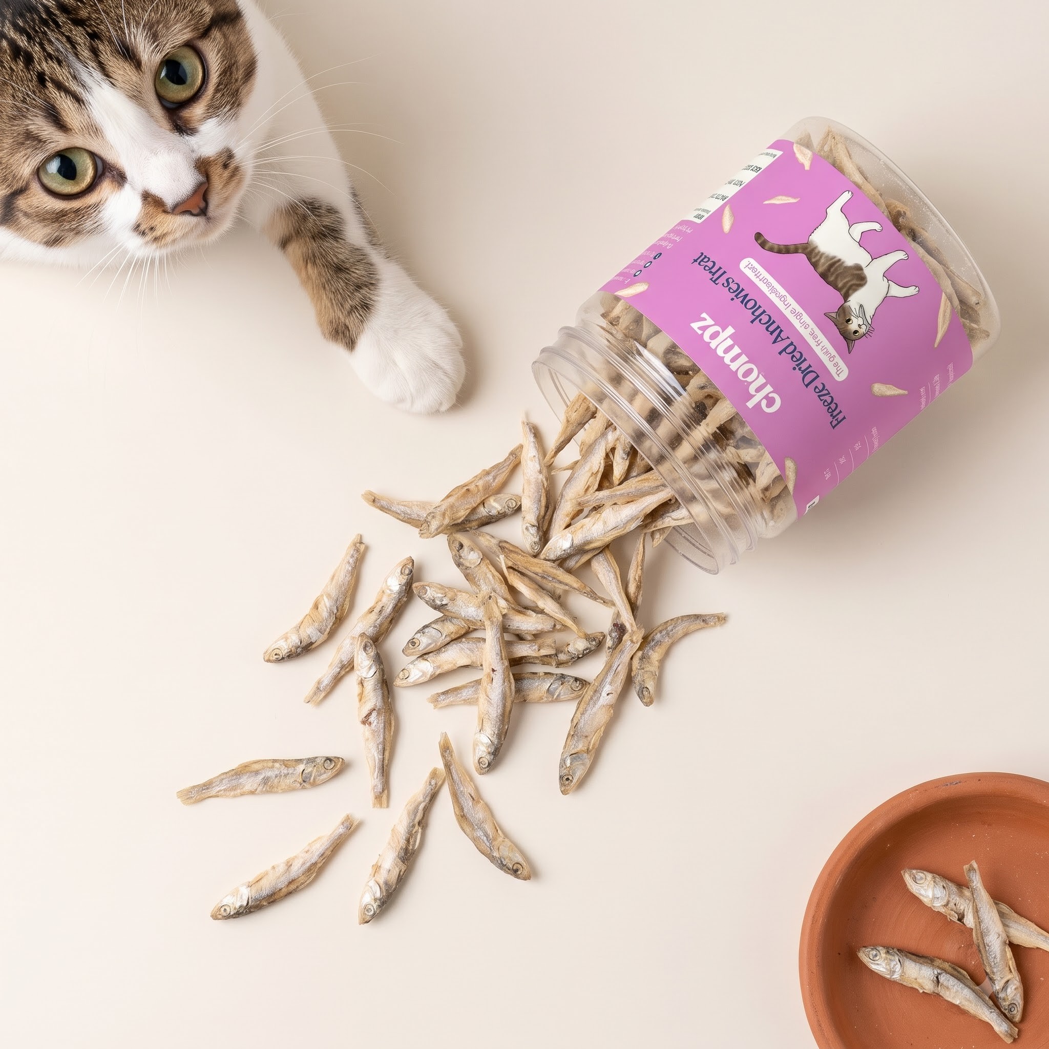
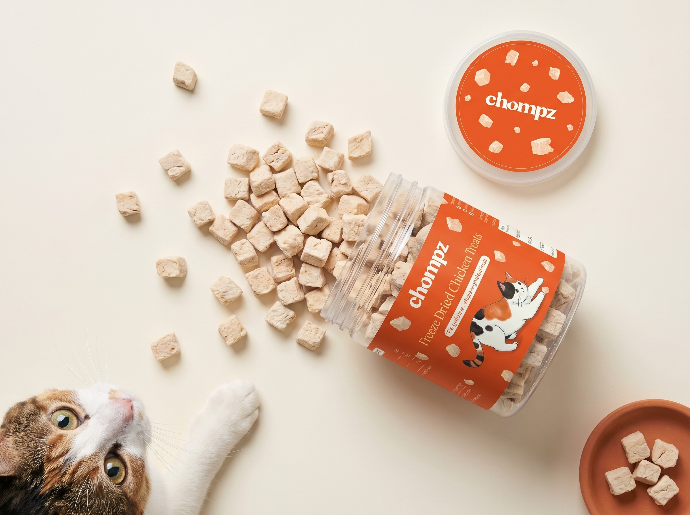
The treats jars needed more energy, so we moved to bold, solid colours while keeping the same clean, ingredient focused structure. Same system, tuned to feel more playful for a reward product.
Solving print and shelf together
A lighter front design meant more flexibility across SKUs, no sample runs needed. Illustration replaced stock imagery, giving Chompz its own identity instead of blending in.
A back of pack that does the heavy lifting
All required information, presented through simple infographics and tables, easy to scan, never cluttered.
Extending the system to treats
The treats jars needed more energy, so we moved to bold, solid colours while keeping the same clean, ingredient focused structure. Same system, tuned to feel more playful for a reward product.
Solving print and shelf together
A lighter front design meant more flexibility across SKUs, no sample runs needed. Illustration replaced stock imagery, giving Chompz its own identity instead of blending in.
A back of pack that does the heavy lifting
All required information, presented through simple infographics and tables, easy to scan, never cluttered.
Extending the system to treats
The treats jars needed more energy, so we moved to bold, solid colours while keeping the same clean, ingredient focused structure. Same system, tuned to feel more playful for a reward product.
Solving print and shelf together
A lighter front design meant more flexibility across SKUs, no sample runs needed. Illustration replaced stock imagery, giving Chompz its own identity instead of blending in.
A back of pack that does the heavy lifting
All required information, presented through simple infographics and tables, easy to scan, never cluttered.
Extending the system to treats
The treats jars needed more energy, so we moved to bold, solid colours while keeping the same clean, ingredient focused structure. Same system, tuned to feel more playful for a reward product.
Solving print and shelf together
A lighter front design meant more flexibility across SKUs, no sample runs needed. Illustration replaced stock imagery, giving Chompz its own identity instead of blending in.
A back of pack that does the heavy lifting
All required information, presented through simple infographics and tables, easy to scan, never cluttered.
Extending the system to treats
The treats jars needed more energy, so we moved to bold, solid colours while keeping the same clean, ingredient focused structure. Same system, tuned to feel more playful for a reward product.
Before
Before
Before
Before
Before
After
After
After
After
After

Treats
Treats
Treats
Treats
Treats



A Note from the Founder
A Note from the Founder
A Note from the Founder
A Note from the Founder
A Note from the Founder
Working with Khyati is one of those things I look forward to every week.
Seeing a call with her on my agenda actually makes me excited for the day!
Over the last 5 months, we’ve collaborated on packaging, comics, and illustrated videos. While her design perspective is amazing (truly), what keeps me going back to working with her goes far beyond that.
1. Her communication is incredibly clear and upfront (which is rare), which means I’ve never once felt anxious or in the dark about what’s happening or how things will move forward 2. She’s proactively involved in ideation beyond the brief, simply because she cares about making the work better 3. The ice-breaking energy she brings into every call makes the entire process so easy going that I never get the jitters
If you’re looking for a design collaborator for illustrations, merch, animation or branding I would highly recommend checking out her work.
She delivers great design without giving you anxiety!

Founder of Chompz
Working with Khyati is one of those things I look forward to every week.
Seeing a call with her on my agenda actually makes me excited for the day!
Over the last 5 months, we’ve collaborated on packaging, comics, and illustrated videos. While her design perspective is amazing (truly), what keeps me going back to working with her goes far beyond that.
1. Her communication is incredibly clear and upfront (which is rare), which means I’ve never once felt anxious or in the dark about what’s happening or how things will move forward 2. She’s proactively involved in ideation beyond the brief, simply because she cares about making the work better 3. The ice-breaking energy she brings into every call makes the entire process so easy going that I never get the jitters
If you’re looking for a design collaborator for illustrations, merch, animation or branding I would highly recommend checking out her work.
She delivers great design without giving you anxiety!
Founder of Chompz
Working with Khyati is one of those things I look forward to every week.
Seeing a call with her on my agenda actually makes me excited for the day!
Over the last 5 months, we’ve collaborated on packaging, comics, and illustrated videos. While her design perspective is amazing (truly), what keeps me going back to working with her goes far beyond that.
1. Her communication is incredibly clear and upfront (which is rare), which means I’ve never once felt anxious or in the dark about what’s happening or how things will move forward 2. She’s proactively involved in ideation beyond the brief, simply because she cares about making the work better 3. The ice-breaking energy she brings into every call makes the entire process so easy going that I never get the jitters
If you’re looking for a design collaborator for illustrations, merch, animation or branding I would highly recommend checking out her work.
She delivers great design without giving you anxiety!
Founder of Chompz
Working with Khyati is one of those things I look forward to every week.
Seeing a call with her on my agenda actually makes me excited for the day!
Over the last 5 months, we’ve collaborated on packaging, comics, and illustrated videos. While her design perspective is amazing (truly), what keeps me going back to working with her goes far beyond that.
1. Her communication is incredibly clear and upfront (which is rare), which means I’ve never once felt anxious or in the dark about what’s happening or how things will move forward 2. She’s proactively involved in ideation beyond the brief, simply because she cares about making the work better 3. The ice-breaking energy she brings into every call makes the entire process so easy going that I never get the jitters
If you’re looking for a design collaborator for illustrations, merch, animation or branding I would highly recommend checking out her work.
She delivers great design without giving you anxiety!
Founder of Chompz
Featured Work
Continue Exploring
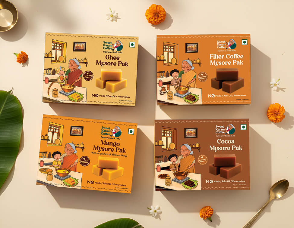
Sweet Karam Coffee
Packaging | Illustration
A cohesive visual update across 14 sweet boxes, designed to feel warm, familiar, and shelf-ready.
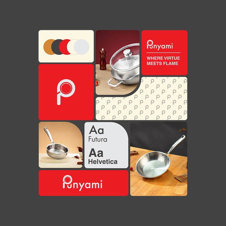
Punyami
Branding | Packaging
Shaped a new cookware brand into a bold yet clear and clean personality.
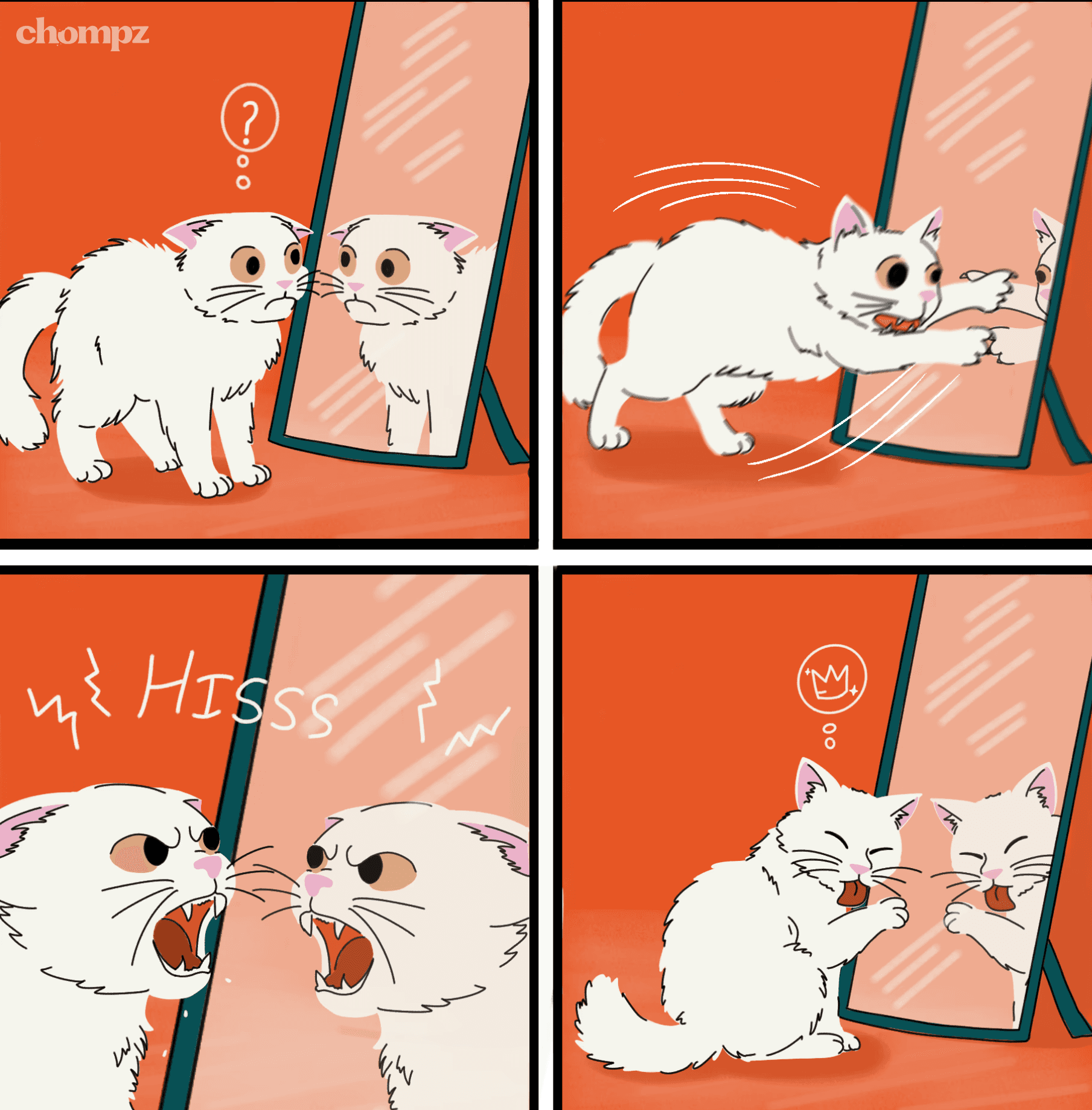
Chompz
Illustration
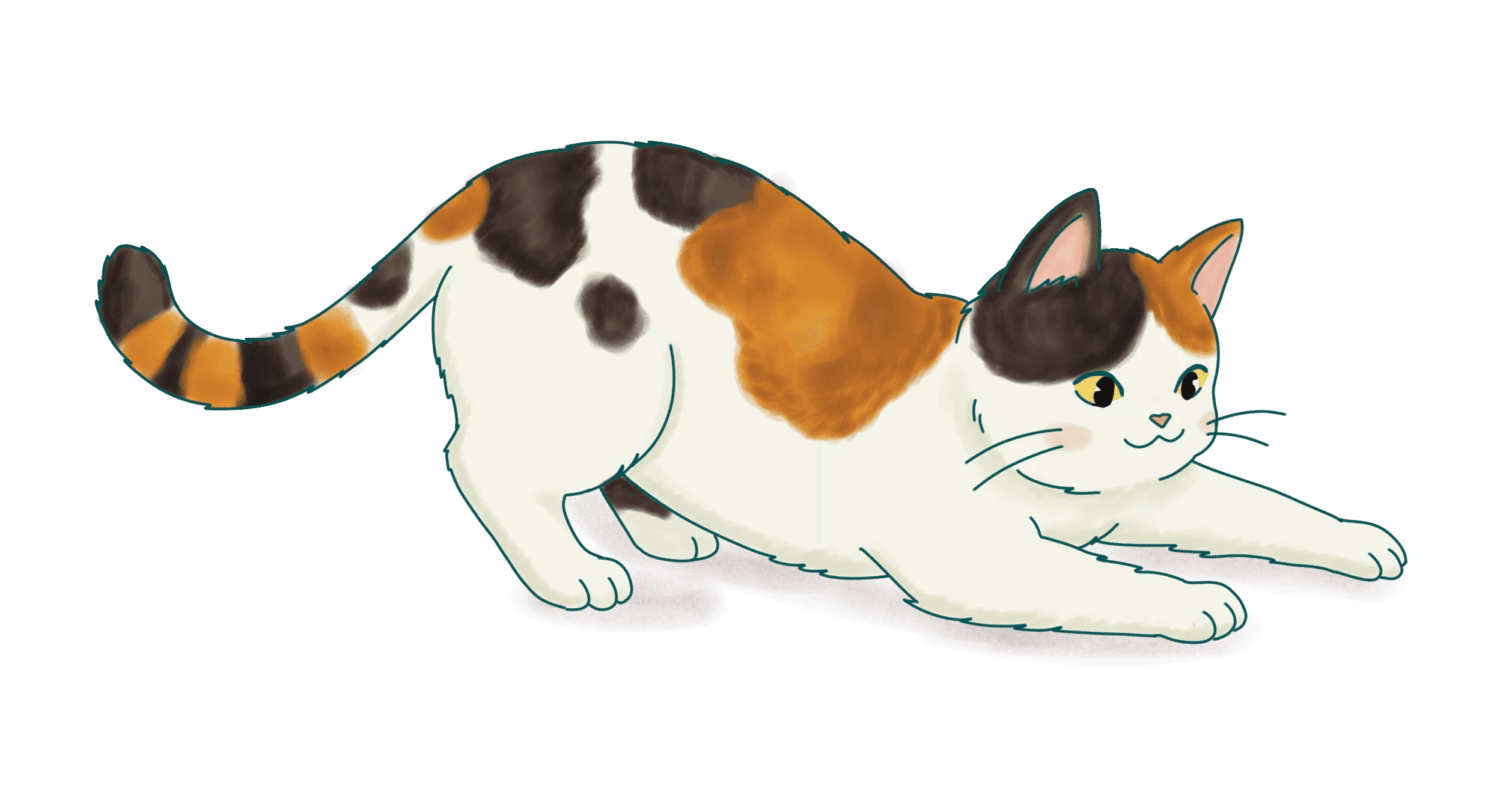
Ongoing comic illustrations for Chomps, developed as a recurring format for social media.
Featured Work
Continue Exploring
Sweet Karam Coffee
Packaging | Illustration
A cohesive visual update across 14 sweet boxes, designed to feel warm, familiar, and shelf-ready.
Punyami
Branding | Packaging
Shaped a new cookware brand into a bold yet clear and clean personality.
Chompz
Illustration
Ongoing comic illustrations for Chomps, developed as a recurring format for social media.
Featured Work
Continue Exploring
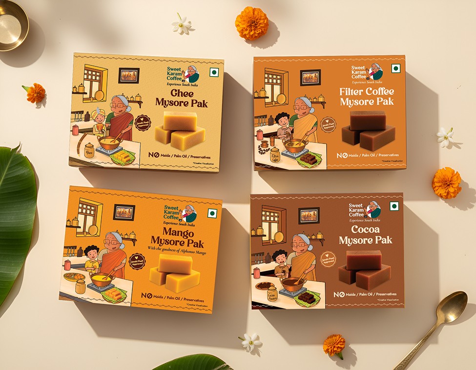
Sweet Karam Coffee
Packaging | Illustration
A cohesive visual update across 14 sweet boxes, designed to feel warm, familiar, and shelf-ready.
Punyami
Branding | Packaging
Shaped a new cookware brand into a bold yet clear and clean personality.
Chompz
Illustration
Ongoing comic illustrations for Chomps, developed as a recurring format for social media.
Featured Work
Continue Exploring
Sweet Karam Coffee
Packaging | Illustration
A cohesive visual update across 14 sweet boxes, designed to feel warm, familiar, and shelf-ready.
Punyami
Branding | Packaging
Shaped a new cookware brand into a bold yet clear and clean personality.
Chompz
Illustration
Ongoing comic illustrations for Chomps, developed as a recurring format for social media.
Featured Work
Continue Exploring
Have a project? Need to consult?
Have a project? Need to consult?
Have a project? Need to consult?
Have a project? Need to consult?
Have a project? Need to consult?
Made with love by Khyati