
Sweet Karam Coffee
Sweet Karam Coffee
Sweet Karam Coffee
Sweet Karam Coffee
Sweet Karam Coffee
Year 2025
Services Packaging Design, Illustration
Scope 14 sweet box SKUs
Year 2025
Services Packaging Design, Illustration
Scope 14 sweet box SKUs
Year 2025
Services Packaging Design, Illustration
Scope 14 sweet box SKUs
Year 2025
Services Packaging Design, Illustration
Scope 14 sweet box SKUs
Year 2025
Services Packaging Design, Illustration
Scope 14 sweet box SKUs
Overview
Overview
Overview
Overview
Overview
Sweet Karam Coffee is a South Indian food brand known for its traditional sweets, snacks, and nostalgic flavours.
As the brand expanded its product range, there was a need to revisit the packaging system for their sweet boxes to ensure consistency, clarity, and stronger brand recall across shelves, while also elevating the overall look and feel.
This project involved redesigning the packaging for 14 sweet boxes, balancing the brand’s warmth and familiarity with a more premium, refined visual presence.
Before The Revamp
Before The Revamp
Before The Revamp
Before The Revamp
Before The Revamp


With multiple sweet variants in the market, the existing packaging had evolved over time.
While each box functioned individually, the range lacked a better cohesive visual language when viewed together.
it became important for the packaging to feel more unified, recognisable, and premium, while still staying rooted in the brand’s loveable South Indian identity and sense of familiarity.
Intent
Intent
Intent
Intent
Intent
The goal of the redesign was to create a packaging system that could scale across multiple SKUs while remaining visually cohesive.
The focus was on:
Establishing a strong, repeatable visual structure
Enabling clear flavour differentiation without breaking consistency
Building emotional connection through warmth and familiarity
Elevating the overall look to feel more premium and refined
Strengthening brand recognition across shelf and quick commerce platforms

MoodBoard
MoodBoard
MoodBoard
MoodBoard
MoodBoard

The visual direction drew from real, everyday South Indian environments, local shops, food rituals, and moments of togetherness. These references formed the foundation for the illustrations, helping capture a sense of familiarity, warmth, and cultural depth.
The visual direction drew from real, everyday South Indian environments, local shops, food rituals, and moments of togetherness. These references formed the foundation for the illustrations, helping capture a sense of familiarity, warmth, and cultural depth.
The visual direction drew from real, everyday South Indian environments, local shops, food rituals, and moments of togetherness. These references formed the foundation for the illustrations, helping capture a sense of familiarity, warmth, and cultural depth.
The visual direction drew from real, everyday South Indian environments, local shops, food rituals, and moments of togetherness. These references formed the foundation for the illustrations, helping capture a sense of familiarity, warmth, and cultural depth.
The visual direction drew from real, everyday South Indian environments, local shops, food rituals, and moments of togetherness. These references formed the foundation for the illustrations, helping capture a sense of familiarity, warmth, and cultural depth.


The final system brings together consistency, warmth, and a refined visual language. Designed to scale across SKUs, it strengthens brand recognition and creates a more confident presence both on shelf and online.
The final system brings together consistency, warmth, and a refined visual language. Designed to scale across SKUs, it strengthens brand recognition and creates a more confident presence both on shelf and online.
The final system brings together consistency, warmth, and a refined visual language. Designed to scale across SKUs, it strengthens brand recognition and creates a more confident presence both on shelf and online.
The final system brings together consistency, warmth, and a refined visual language. Designed to scale across SKUs, it strengthens brand recognition and creates a more confident presence both on shelf and online.
The final system brings together consistency, warmth, and a refined visual language. Designed to scale across SKUs, it strengthens brand recognition and creates a more confident presence both on shelf and online.
A Note from the Founder
A Note from the Founder
A Note from the Founder
A Note from the Founder
A Note from the Founder
I had the privilege of working closely with Khyati , and I cannot recommend her highly enough. She is a powerhouse of creativity, passion, and determination, bringing energy and enthusiasm to every project.
Her illustration skills are truly remarkable, and she has a unique ability to transform ideas into visually stunning designs that captivate audiences.
What sets Khyati apart is her unwavering ambition and thirst for growth. She is always seeking opportunities to refine their skills, learn new techniques, and push the boundaries. Her commitment to excellence is inspiring.
Whether collaborating on a team or managing independent projects, Khyati is a reliable and innovative professional who delivers beyond expectations. If you're looking for a talented graphic designer with a passion for creating exceptional visual experiences, she is the person to connect with.
It has been a pleasure to witness Khyati's journey, and I am excited to see all the incredible things she will achieve in the future!

CEO, Founder of Sweet Karam Coffee
I had the privilege of working closely with Khyati , and I cannot recommend her highly enough. She is a powerhouse of creativity, passion, and determination, bringing energy and enthusiasm to every project.
Her illustration skills are truly remarkable, and she has a unique ability to transform ideas into visually stunning designs that captivate audiences.
What sets Khyati apart is her unwavering ambition and thirst for growth. She is always seeking opportunities to refine their skills, learn new techniques, and push the boundaries. Her commitment to excellence is inspiring.
Whether collaborating on a team or managing independent projects, Khyati is a reliable and innovative professional who delivers beyond expectations. If you're looking for a talented graphic designer with a passion for creating exceptional visual experiences, she is the person to connect with.
It has been a pleasure to witness Khyati's journey, and I am excited to see all the incredible things she will achieve in the future!
CEO, Founder of Sweet Karam Coffee
Featured Work
Continue Exploring
Sweet Karam Coffee
Packaging | Illustration
A cohesive visual update across 14 sweet boxes, designed to feel warm, familiar, and shelf-ready.
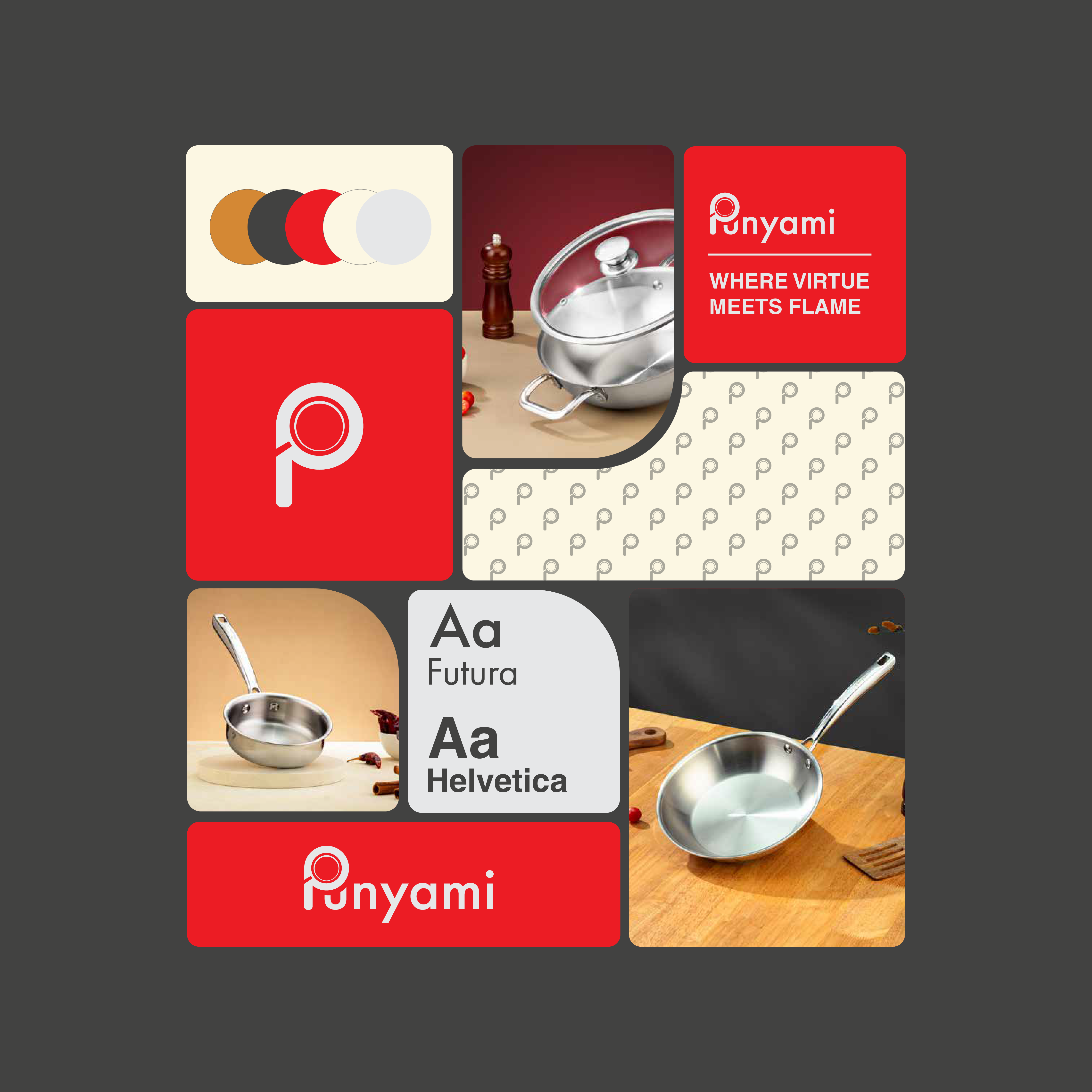
Punyami
Branding | Packaging
Shaped a new cookware brand into a bold yet clear and clean personality.

Chompz
Illustration
Ongoing comic illustrations for Chomps, developed as a recurring format for social media.
Featured Work
Continue Exploring
Sweet Karam Coffee
Packaging | Illustration
A cohesive visual update across 14 sweet boxes, designed to feel warm, familiar, and shelf-ready.
Punyami
Branding | Packaging
Shaped a new cookware brand into a bold yet clear and clean personality.
Chompz
Illustration
Ongoing comic illustrations for Chomps, developed as a recurring format for social media.
Featured Work
Continue Exploring
Have a project? Need to consult?
Have a project? Need to consult?
Have a project? Need to consult?
Have a project? Need to consult?