
Punyami
Punyami
Punyami
Punyami
Punyami
Year 2025
Services Branding, Packaging Design
Scope Brand Design & 6 SKUs
Year 2025-Present
Services Illustration
Scope Ongoing Editorial Illustrations
Year 2025-Present
Services Illustration
Scope Ongoing Editorial Illustrations
Year 2025-Present
Services Illustration
Scope Ongoing Editorial Illustrations
Year 2025-Present
Services Illustration
Scope Ongoing Editorial Illustrations
Overview
Overview
Overview
Overview
Overview
This project involved developing the brand identity and packaging system for Punyami, a cookware brand positioned differently within the Indian market. While many brands in the category lean heavily traditional or purely functional, Punyami was designed to balance cultural depth with modern refinement.
The intent was to keep the brand rooted in Indian warmth through colour and emotion, while following the discipline, simplicity, and structural clarity inspired by Japanese modernism. Together, these decisions shape Punyami into a cohesive and premium cookware brand defined by precision and quiet confidence.
Logo & Branding
Logo & Branding
Logo & Branding
Logo & Branding
Logo & Branding
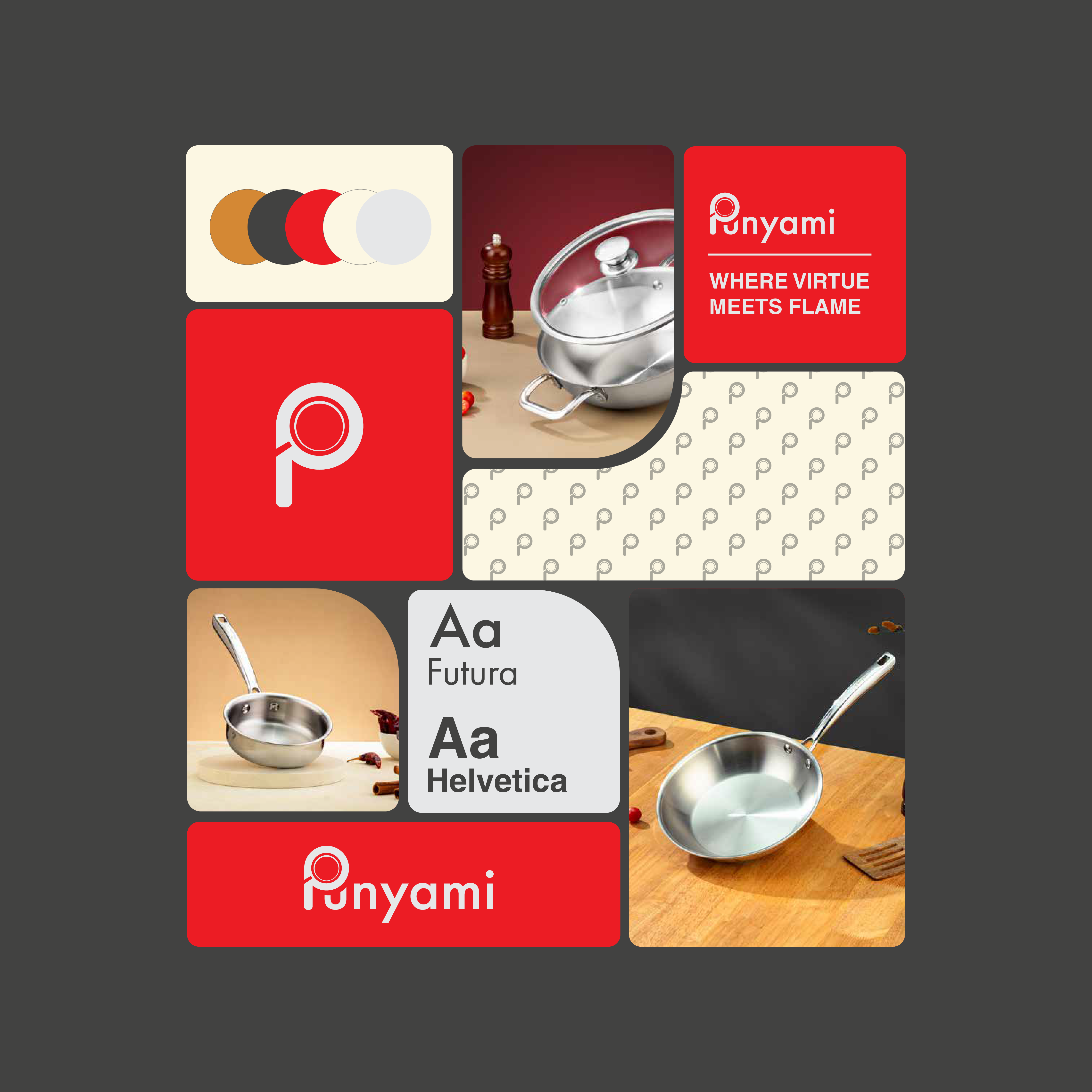
Punya means virtue in Hindi, reflecting good karma and intention, while Mi draws from Japanese beauty, symbolising minimal and refined aesthetics.
The logo was designed to be structured, and clean, with red as the primary colour to connect both Indian tradition and Japanese cultural significance.
A controlled use of colour was adopted, combining strong red with earthy tones to ground the brand in Indian warmth while maintaining refinement.
The overall visual system follows disciplined, minimal design principles, reflecting Japanese craftsmanship and structural clarity.


Shown here as a brand application example. The design was created by the Punyami team and is not part of this project.
Shown here as a brand application example. The design was created by the Punyami team and is not part of this project.
Shown here as a brand application example. The design was created by the Punyami team and is not part of this project.
Shown here as a brand application example. The design was created by the Punyami team and is not part of this project.


Packaging
Packaging
Packaging
Packaging
Packaging
Punya means virtue in Hindi, reflecting good karma and intention, while Mi draws from Japanese beauty, symbolising minimal and refined aesthetics.
The logo was designed to be structured, and clean, with red as the primary colour to connect both Indian tradition and Japanese cultural significance.
A controlled use of colour was adopted, combining strong red with earthy tones to ground the brand in Indian warmth while maintaining refinement.
The overall visual system follows disciplined, minimal design principles, reflecting Japanese craftsmanship and structural clarity.
Featured Work
Continue Exploring

Sweet Karam Coffee
Packaging | Illustration
A cohesive visual update across 14 sweet boxes, designed to feel warm, familiar, and shelf-ready.
Punyami
Branding | Packaging
Shaped a new cookware brand into a bold yet clear and clean personality.

Chompz
Illustration
Ongoing comic illustrations for Chomps, developed as a recurring format for social media.
Featured Work
Continue Exploring
Sweet Karam Coffee
Packaging | Illustration
A cohesive visual update across 14 sweet boxes, designed to feel warm, familiar, and shelf-ready.
Punyami
Branding | Packaging
Shaped a new cookware brand into a bold yet clear and clean personality.
Chompz
Illustration
Ongoing comic illustrations for Chomps, developed as a recurring format for social media.
Featured Work
Continue Exploring


Have a project? Need to consult?
Have a project? Need to consult?
Have a project? Need to consult?
Have a project? Need to consult?